Module 2: Styling the Web - Advanced HTML and CSS Fundamentals
Master CSS Flexbox, Grid, and the Box Model. Learn how to transform plain HTML into professional, responsive web layouts with this comprehensive guide to modern CSS fundamentals.
1. MODULE OVERVIEWh2
In Module 1, we built the bare structure of a webpage and learned how to track our progress using Git. We established the foundation. Now, we are going to expand that structure and bring it to life visually.
This module introduces you to advanced HTML concepts and the fundamentals of CSS (Cascading Style Sheets). You will learn how to take a plain text document and turn it into a modern, visually appealing web layout.
Important Expectation: Making things look exactly right on a screen takes patience. You will encounter visual bugs where things do not align perfectly on the first try. Remember the debugging mindset from Module 1: check your work step-by-step, and do not panic.
2. LEARNING OBJECTIVESh2
By the end of this module, you will be able to:
- Use Semantic HTML to properly describe and organize web content.
- Explain how CSS targets and styles specific HTML elements.
- Master the CSS Box Model to space and size elements correctly.
- Build a simple, modern layout using CSS Flexbox.
- Combine HTML, CSS, and Git to build and track a fully styled project.
3. EXPANDING OUR HTML (The Blueprint Extension)h2
Before we can paint the house, we need to make sure the rooms are built correctly. In Module 1, we used basic tags like <h1> and <p>. Now, we will look at how to organize larger chunks of content.
3.1 Semantic HTMLh3
In the past, developers used the <div> tag for absolutely everything. While a <div> is a great general-purpose container, relying only on it makes your code hard to read.
Semantic HTML means using tags that clearly describe their purpose to both the developer and the browser.
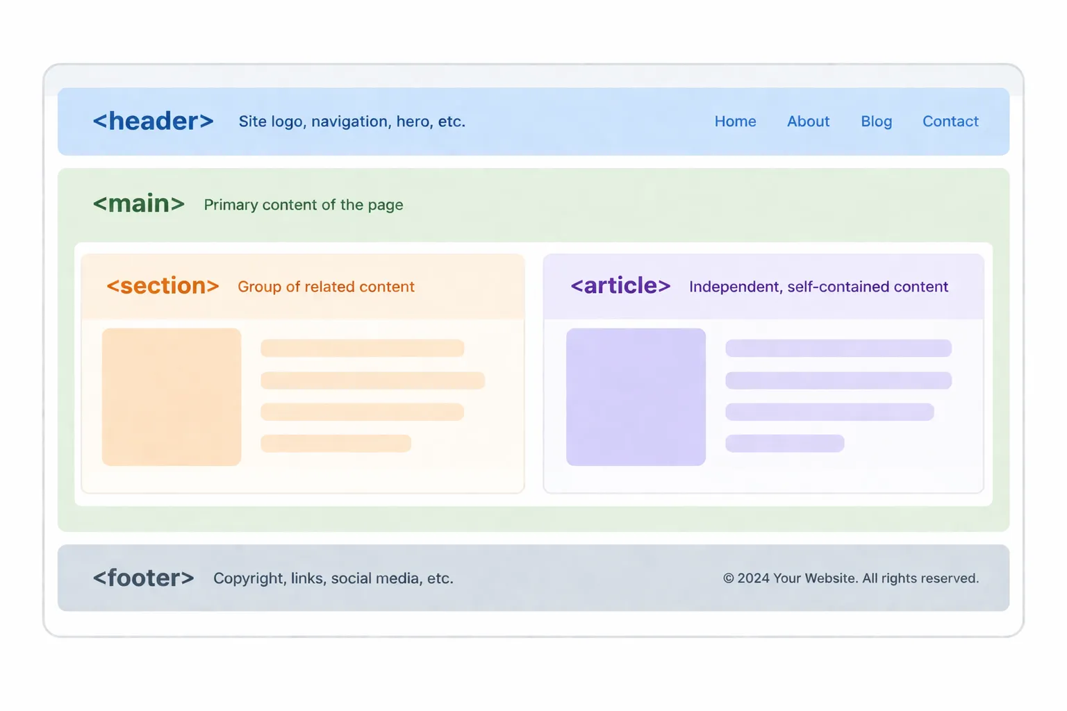
Common semantic tags include:
<header>: For the top section of your page (logos, navigation).<main>: For the primary content of your webpage.<section>: For grouping related content together.<article>: For independent, self-contained content.<footer>: For the bottom section of your page (copyright, bottom links).
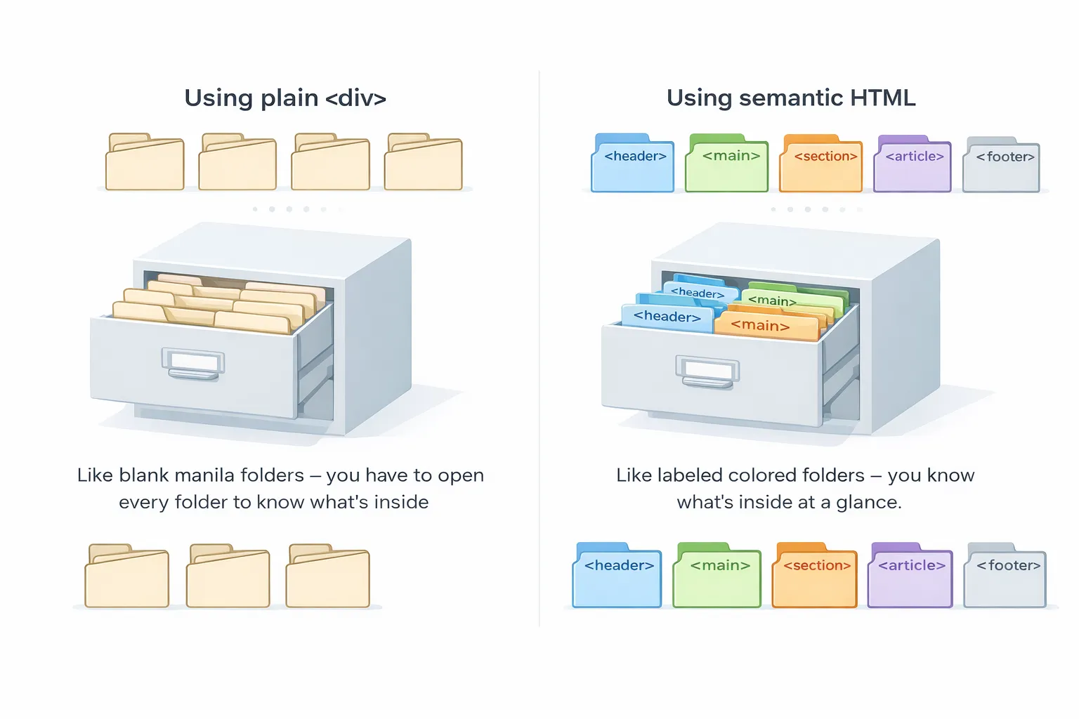
3.2 The Filing Cabinet Analogyh3
Think of your webpage as a large Filing Cabinet:
- If every folder is just a blank manila folder (using only
<div>), you have to open every single one to know what is inside. - Semantic HTML is like adding colored, labeled tabs to those folders. You, other developers, and screen readers immediately know exactly what purpose each section serves without having to guess.
3.3 The Hidden Settings: Understanding the <head>h3
While the tags above organize the visible part of your site, there is a crucial section that remains invisible: the <head>.
If the <body> is the physical building that people walk into, the <head> is the building’s registration papers and instruction manual. It tells the browser how to handle the page.
Here are the critical tags that go inside the <head>:
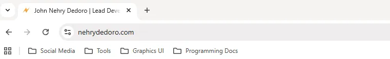
<title>: The text that appears in the browser tab. This is crucial for Google Search (SEO).
<meta charset="UTF-8">: Tells the browser to use the standard character set, ensuring emojis and special symbols load correctly without turning into weird question marks.<meta name="viewport" content="width=device-width, initial-scale=1.0">: The “Mobile-Friendly” tag. Without this, your website will look like a tiny, zoomed-out desktop site on a mobile phone.
Example Setup:
<!DOCTYPE html><html><head> <meta charset="UTF-8"> <meta name="viewport" content="width=device-width, initial-scale=1.0"> <title>John Nehry Dedoro | Lead Developer</title></head><body> </body></html>3.4 The Universal Wrappers: <div> and <span>h3
Even with semantic tags, you will still frequently need invisible boxes to group elements together for styling purposes. The two most common tools for this are <div> and <span>.
1. The <div> Tag (Block-Level)h4
Think of a <div> as a large cardboard moving box. It is a “block-level” element, meaning it takes up the full width of the screen and forces everything after it onto a new line. You use divs to group internal sections together (like wrapping an image and a button into one “Profile Card”).
2. The <span> Tag (Inline)h4
Think of a <span> as a yellow highlighter marker. It is an “inline” element. It only wraps around the exact text or content inside it without breaking to a new line. You use it when you want to target a single word inside a paragraph to change its color later with CSS.
Disclaimer: The following example uses Tailwind CSS (a highly popular, modern CSS framework used by professionals) to demonstrate how text hierarchy is styled in the real world. You do not need to memorize these
classnames right now! For this stage of the module, simply focus on how the HTML tags (<h1>,<h2>,<strong>,<em>) provide the structure, while the classes provide the visual paint.
Example Code:
<div class="bg-primary-foreground px-4 border"> <h2>My Favorite Quote</h2> <p>This whole section is grouped inside a moving box. But <span class="text-primary-foreground bg-accent-foreground p-1 rounded-2xl">this specific word</span> is wrapped in a span so I can style it differently.</p></div>Result:
My Favorite Quote
This whole section is grouped inside a moving box. But this specific word is wrapped in a span so I can style it differently.
3.5 Text Formatting and Hierarchy (The Typography Rules)h3
HTML provides six levels of headings (<h1> to <h6>). In professional development, headings are not just for making text big, they define the structural outline of your page for screen readers and search engines.
-
<h1>: The main title of the page. Rule of thumb: Only use one<h1>per page. -
<h2>: Major section headers (e.g., “About Us”, “Services”). -
<h3>: Sub-sections under an<h2>(e.g., “Web Design”, “SEO Consulting”). -
<h4>to<h6>: Used for increasingly smaller sub-sections.
Professional Text Semantics: Instead of just making text bold or italic visually, use these tags to give the text actual meaning:
-
<strong>: Indicates critical importance. (Browsers render this as bold). -
<em>: Indicates verbal emphasis. (Browsers render this as italicized). -
<br>: A line break. It forces the text to drop to the next line. (This is a “self-closing” tag, no
needed). -
<hr>: A horizontal rule. It draws a visible line across the page to separate content.
Example Code:
<div class=" p-8 bg-slate-50 rounded-xl shadow-sm font-sans">
    <h1 class="text-4xl font-extrabold text-slate-900 tracking-tight mb-4">        The Art of Web Development    </h1>
    <h2 class="text-2xl font-semibold text-indigo-600 border-b border-indigo-100 pb-2 mb-4">        Chapter 1: The Foundations    </h2>
    <p class="text-slate-700 text-lg leading-relaxed mb-6">        Learning to code can feel overwhelming at first, but mastering the basics is <strong>absolutely critical</strong> for your long-term success. Always remember that every senior developer you meet was once a <em>complete beginner</em>.    </p>
    <hr class="border-slate-200 my-6">
    <h3 class="text-xl font-medium text-slate-800 mb-3">        Key Principles to Remember    </h3>
    <p class="text-slate-600 leading-relaxed">        Focus on writing clean, semantic HTML before moving on to complex visual designs.<br>        <span class="text-sm text-slate-500 italic">Pro-Tip: Take your time and practice writing code daily.</span>    </p>
</div>
Example of how it looks like:
The Art of Web Development
Chapter 1: The Foundations
Learning to code can feel overwhelming at first, but mastering the basics is absolutely critical for your long-term success. Always remember that every senior developer you meet was once a complete beginner.
Key Principles to Remember
Focus on writing clean, semantic HTML before moving on to complex visual designs.
Pro-Tip: Take your time and practice writing code daily.
What is happening here?
-
The
<h1>is styled to be massive and heavy (text-4xl font-extrabold) because it is the most important text on the page, capturing immediate attention. -
The
<h2>uses a distinct color and a bottom border (text-indigo-600 border-b) to clearly divide a new major section of content. -
The
<strong>and<em>tags give deep structural meaning to the text (which search engines love), while the browser naturally applies the bold and italic visual effects to them. -
A
<span>is used at the very end to specifically target the “Pro-Tip” text, allowing us to make just that one sentence smaller, gray, and italicized (text-sm text-slate-500 italic) without affecting the rest of the paragraph.
3.6 Working with Links (Connecting the Web)h3
The Anchor Tag (<a>) creates hyperlinks. It requires the href (Hypertext Reference) attribute to know where to send the user.
The Standard for External Links: When linking to a different website, professional developers use two extra attributes for usability and security:
-
target="_blank": Opens the link in a new tab so the user doesn’t lose your website. -
rel="noopener noreferrer": A crucial security measure that prevents the new tab from maliciously hijacking your original page.
<a href="[https://github.com](https://github.com)" target="_blank" rel="noopener noreferrer">Visit my GitHub</a>
<a href="contact.html">Contact Me</a>
3.7 Working with Media (Images the Right Way)h3
The <img> tag embeds a picture. It is self-closing and requires two attributes:
-
src(Source): The file path of the image. -
alt(Alternative Text): A text description of what the image shows.
Why is alt text mandatory? If an image fails to load, the alt text appears. More importantly, visually impaired users rely on screen readers that read the alt text out loud.
The Performance Boost:
Adding loading="lazy" tells the browser to only load the image when the user actually scrolls down to see it, making your website load much faster.
<img src="assets/images/profile.jpg" alt="A professional headshot of the developer" loading="lazy">3.8 Organizing Data with Tables (The Standard Structure)h3
When you need to display structured data (like a pricing schedule), you use an HTML Table.
While it might seem quicker to just use rows (<tr>) and data cells (<td>), the industry standard practice is to structure tables into three distinct semantic sections. This ensures your data is accessible to screen readers and much easier to style:
<thead>: The header section (for column titles).<tbody>: The main body containing the data.<tfoot>: The footer section (for totals or summaries).
Example Code:
<table> <thead> <tr> <th>Service</th> <th>Price</th> </tr> </thead> <tbody> <tr> <td>Web Design</td> <td>PHP 500.00</td> </tr> </tbody> <tfoot> <tr> <td><strong>Total</strong></td> <td><strong>PHP 500.00</strong></td> </tr> </tfoot></table>Example of how it looks like:
| Service | Price |
|---|---|
| Web Design | PHP 500.00 |
| Total | PHP 500.00 |
Important Reminder: Never use tables to build the layout of your website. Tables are strictly for displaying data. We will use CSS Flexbox for layouts later in this module.
3.4 Check Your Knowledgeh3
Before we move on to CSS, let’s ensure you’re comfortable with the more advanced HTML elements we’ve covered, like tables and semantic tags.
4. INTRODUCTION TO CSS (The Interior Design)h2
Now that our HTML structure is solidly built with proper semantic tags, it is time to make it visually appealing.
4.1 What is CSS and Why “Cascading”?h3
CSS stands for Cascading Style Sheets. If HTML dictates what content is on the screen, CSS dictates how that content looks. It controls colors, fonts, spacing, alignment, and even animations.
The Waterfall Analogy: Why is it called “Cascading”? Think of a waterfall pouring down a mountain. In CSS, rules flow from top to bottom. If you give the browser two conflicting rules (e.g., you tell the text to be blue at the top of your file, but later tell it to be red), the rule closest to the bottom of the “waterfall” wins. The styles cascade down, and the most specific or final rule overrides the general ones.
4.2 The Interior Design Analogyh3
Think of building a house:
- HTML is the concrete foundation, the wooden frames, the drywall, and the electrical wiring. It is highly functional but raw and unfinished.
- CSS is the interior design. It is the paint on the walls, the type of hardwood flooring, the arrangement of the furniture, and the modern lighting fixtures.
A house with only HTML works, but a house with CSS feels like a home.
4.3 Three Ways to Add CSS (And the Industry Standard)h3
There are three ways to apply CSS to your HTML. While you will see all three in the wild, one is strictly preferred by professionals.
1. Inline Styling (The “Quick Fix”)
You write the style directly inside the HTML tag using the style attribute.
- Pros: Overrides almost everything else.
- Cons: It is a nightmare to manage. If you have 50 buttons and want to change their color, you have to edit 50 individual tags. It can’t override using internal or external styling even add
!important. Professionals avoid this.
<h1 style="color: red; font-size: 24px;">Welcome to my website</h1>2. Internal Styling (The “Single Page” Method)
You write your CSS inside a <style> tag, which is placed inside the <head> of your HTML document.
- Pros: Keeps styles on the same page, good for quick testing.
- Cons: If your website has 10 different pages (Home, About, Contact, etc.), you have to copy-paste this
<style>block onto every single page.
<head> <style> h1 { color: blue; font-size: 24px; } </style></head>3. External Styling (The Professional Standard)
You create a separate file (e.g., styles.css) and link it to your HTML using the <link> tag inside the <head>.
- Pros: This is the industry standard. It keeps your HTML clean and your styles organized. If you need to change the design of your entire website, you only edit one file.
- Cons: You must remember to link the file on every page.
<head> <link rel="stylesheet" href="styles.css"></head>4.4 The CSS Rule-Set (The Syntax)h3
When writing Internal or External CSS, you rely on a strict syntax called a rule-set. You must tell the browser exactly what you want to style, and how you want to style it.
Here is the anatomy of a standard CSS rule:
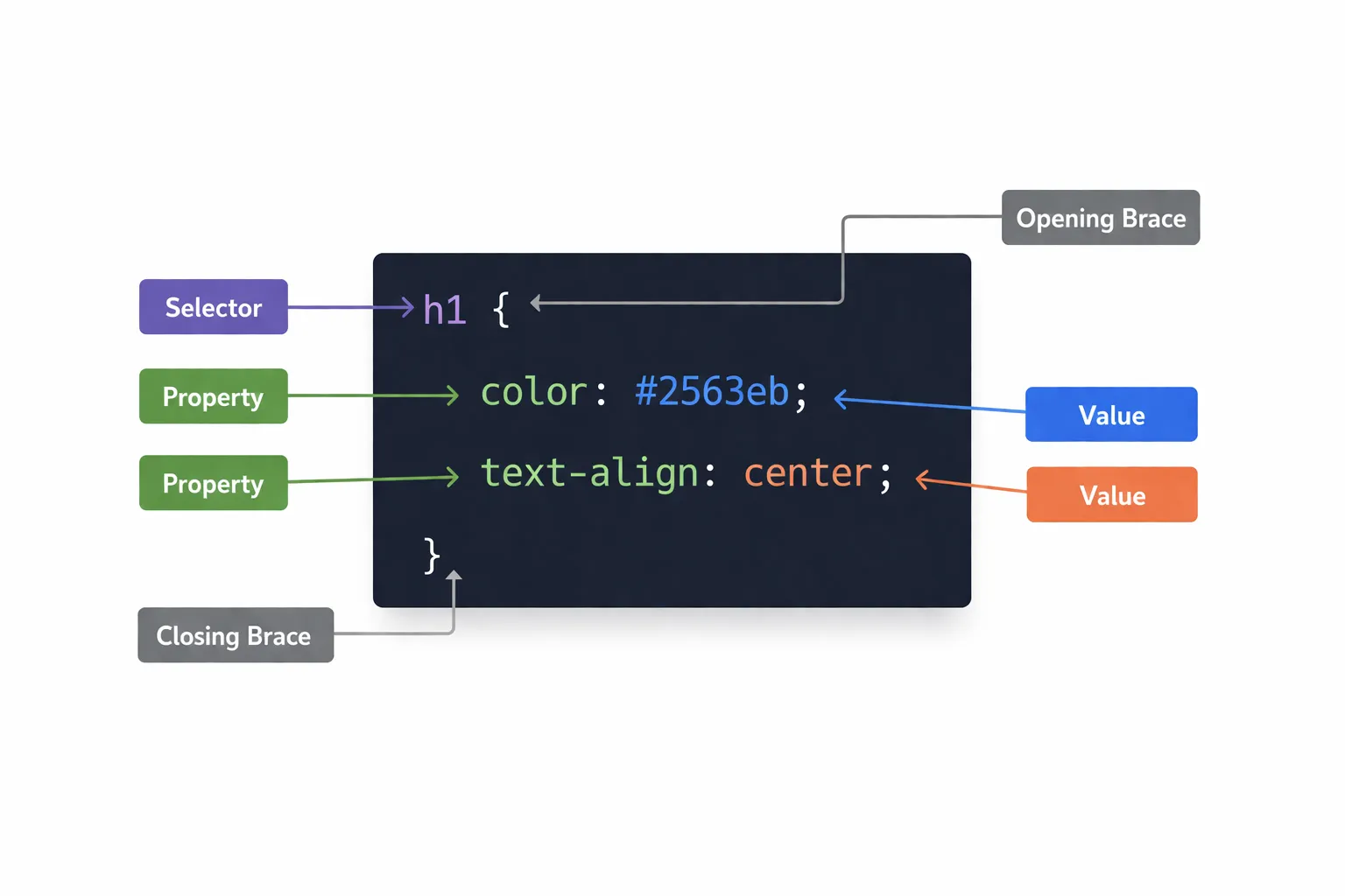
The Breakdown:
-
Selector (h1):The HTML element you want to target. -
Declaration Block ({ ... }):The curly braces act as a container for your styling rules. -
Property (color):The specific feature you want to change. -
Value (#2563eb):The setting you are applying to the property.
Crucial Detail: Always remember to close every single rule with a semicolon (;). Forgetting a semicolon is the number one reason why CSS suddenly stops working!
4.5 The Three Main Selectors (How to Target Elements)h3
If you just use an element selector like p, you will change every single paragraph on your entire website. To be specific, we use Classes and IDs.
1. Element Selector: Targets all standard HTML tags of that type.
p { color: gray; }h1 { color: blue; }div { color: green; }2. Class Selector (The Daily Standard)
Classes are reusable labels you add to your HTML. You can use the same class on multiple elements. In CSS, you target a class by putting a period (.) in front of its name.
html:
<div class="card">...</div><div class="card">...</div>css:
.card { border: 1px solid #ccc; padding: 16px; border-radius: 8px;}3. ID Selector (The Unique Identifier)h3
IDs are like a fingerprint. You can only use a specific ID once per page. In CSS, you target an ID by putting a hashtag (#) in front of its name.
html:
<nav id="main-navigation">...</nav>css:
#main-navigation { background-color: #f8f9fa; padding: 20px;}4.6 Check Your Knowledgeh3
Take a moment to review the core concepts of CSS syntax and selectors before we dive into the Box Model.
5. THE CSS BOX MODEL (The Core Mechanic)h2
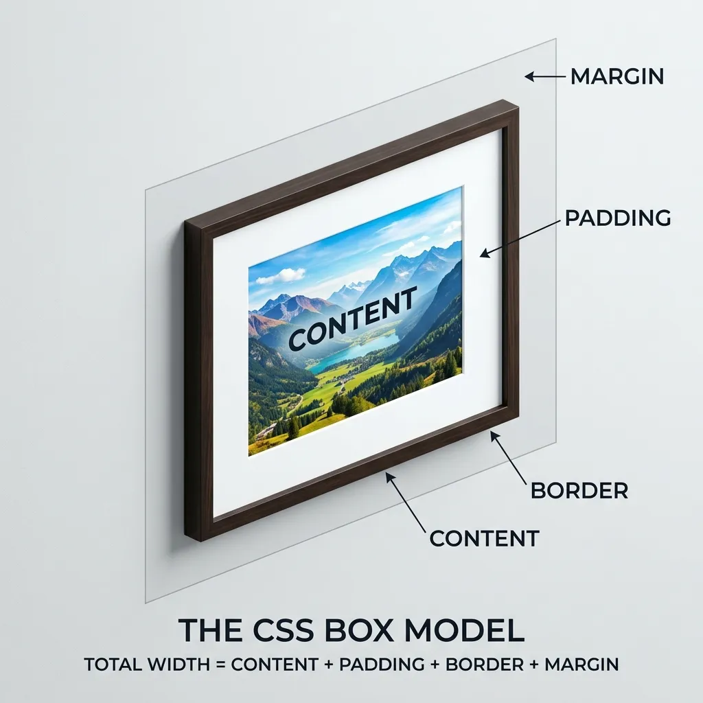
If there is only one concept you master in CSS, it must be the Box Model. Understanding this is the difference between blindly guessing why your layout is broken and knowing exactly how to fix it.
5.1 The Golden Rule: Everything is a Boxh3
In web development, every single HTML element is an invisible rectangle. Whether it is an <h1>, a <p>, or an <img> shaped like a circle, the browser treats it as a rectangular box. The CSS Box Model dictates exactly how that box behaves, how big it gets, and how it pushes other boxes around.
5.2 The Picture Frame Analogyh3
To understand the Box Model, imagine a framed photograph hanging on a wall. The Box Model consists of four distinct layers, starting from the inside out:
- Content (The Photograph): The actual text, image, or video you want to display.
- Padding (The Matting): The empty, internal space between the photograph and the wooden frame. It keeps the content from pressing right up against the edges.
- Border (The Wooden Frame): The visible line that surrounds the padding and the content.
- Margin (The Wall Space): The invisible, external space outside the frame. This is what pushes other pictures away so they don’t overlap on the wall.
5.3 Writing the Box Model in CSSh3
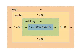
Here is how you apply these four layers in actual code:
.profile-card {    /* 1. Content */    width: 300px;    height: 400px;    background-color: white;
    /* 2. Padding (Internal Space) */    padding: 20px;
    /* 3. Border */    border: 2px solid black;
    /* 4. Margin (External Space) */    margin: 15px;}
Pro-Tip (Shorthand): You can set margins and padding for specific sides using margin-top, padding-left, etc. If you just write padding: 20px;, it applies 20px to all four sides simultaneously.
5.4 The Industry Standard Reset (box-sizing)h3
By default, the CSS Box Model has a massive mathematical flaw.
If you tell a box to be 300px wide, but then add 20px of padding and a 2px border, the browser adds those numbers together. Your box is now suddenly 344px wide (300 + 20 left + 20 right + 2 left + 2 right), which completely breaks your layout.
To fix this, professional developers apply a “CSS Reset” at the very top of their stylesheet. We use the * (universal selector) to target every element and apply box-sizing: border-box.
This forces the browser to include the padding and border inside the width you set, rather than expanding the box outward.
/* Add this to the very top of your style.css file */* { box-sizing: border-box; margin: 0; padding: 0;}5.5 Visualizing the Box (Browser Developer Tools)h3
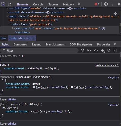
You don’t have to guess how big your boxes are. Remember the Developer Tools from Module 1?
- Right-click any element on your webpage.
- Click Inspect.
- Look at the bottom right corner of the Developer Tools panel.
- You will see a literal, color-coded diagram of the Box Model. You can hover over the padding, border, or margin to see exactly how much space is being taken up in real-time.
5.6 Check Your Knowledgeh3
The Box Model is the foundation of all CSS layouts. Let’s make sure you’ve got the hang of how padding, borders, and margins work together.
6. MODERN LAYOUTS: INTRO TO FLEXBOXh2
Before, arranging boxes on a screen was one of the most frustrating parts of web development. Developers had to rely on “hacks” using math, floats, and margins just to get two boxes to sit next to each other.
Then came Flexbox (Flexible Box Layout), and it completely changed the game.
6.1 The Parent and Child Ruleh3
The most important rule of Flexbox is understanding the relationship between containers.
Flexbox is not applied to the item you want to move; it is applied to the container holding the items.
- The container is the Parent.
- The items inside are the Children.
When you tell the Parent to become a Flexbox, you are giving it complete control over how its Children are organized.
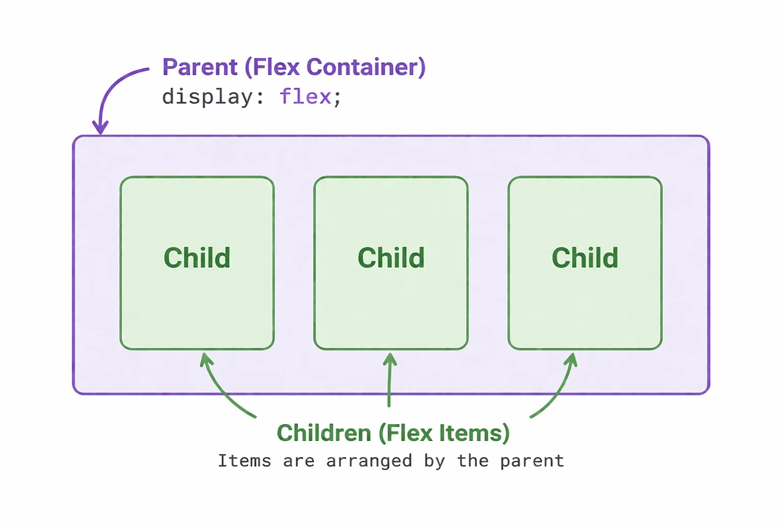
6.2 The Magic Spell (display: flex)h3
To turn a normal container into a Flexbox, you only need one line of CSS:
/* Parent */.container {    display: flex;}
/* Children */.item { background-color: #f8f9fa; padding: 20px; border: 1px solid #ccc; width: 100px; height: 100px; margin: 10px;}<div class="container"> <div class="item">1</div> <div class="item">2</div> <div class="item">3</div></div>By default, the moment you add this line, all the child items inside that container will automatically line up horizontally in a row, shrinking to fit their content.
6.3 The Three Main Controlsh3
Once a container is a Flexbox, you get access to powerful new properties to move the children around.
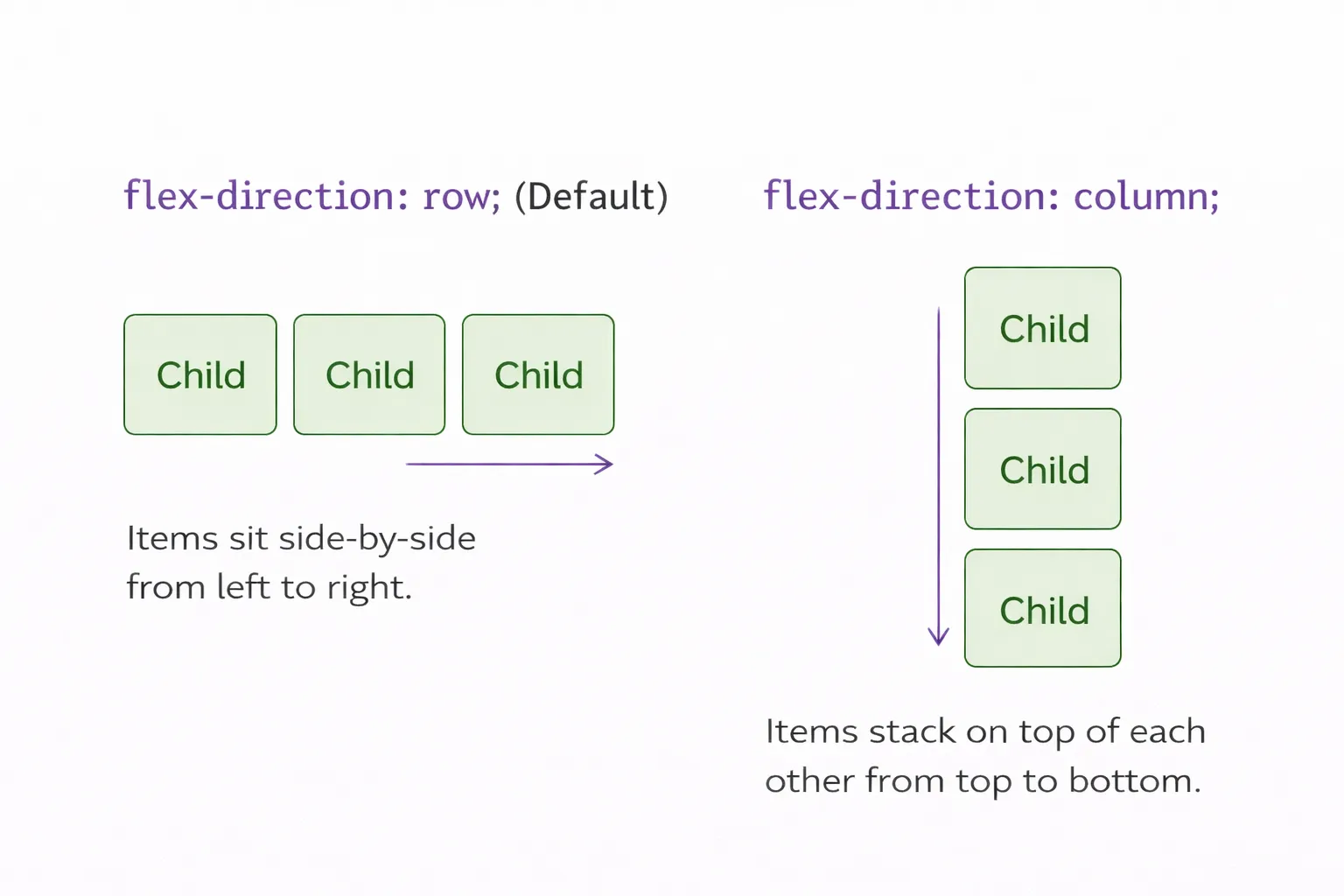
1. flex-direction (The Track)h4
This determines the direction the children will flow.
*flex-direction: row; (Default) — Items sit side-by-side from left to right.
* flex-direction: column; — Items stack on top of each other from top to bottom.
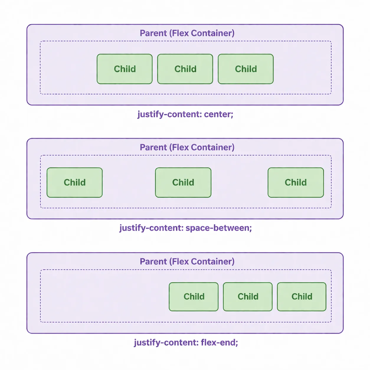
2. justify-content (The Main Axis)h4
This aligns the children along the main direction of the track (horizontally, if it’s a row).
- justify-content: center; — Pushes all items to the exact center.
- justify-content: space-between; — Pushes the first item to the far left, the last to the far right, and evenly spaces the rest in the middle (perfect for navigation bars!).
- justify-content: flex-end; — Pushes everything to the end of the line.
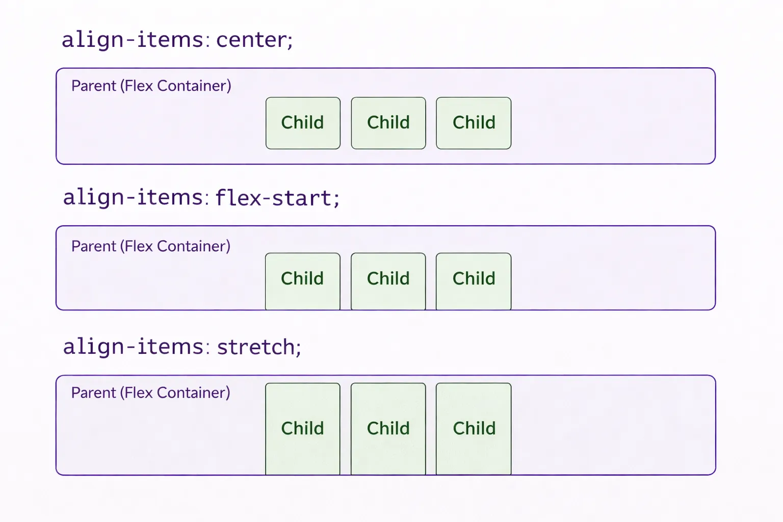
3. align-items (The Cross Axis)h4
This aligns the children on the opposite axis (vertically, if it’s a row).
- align-items: center; — Centers the items vertically within the container.
- align-items: flex-start; — Pushes items to the top.
- align-items: stretch; — Stretches the items to fill the entire height of the container.
6.4 The Developer Milestone: Centering a Divh3
For decades, the running joke in the tech industry was that it was impossible to perfectly center a box both horizontally and vertically on a screen.
With Flexbox, it is exactly three lines of code. This is a standard setup you will use in almost every project:
Example code:
/* The CSS */.screen-wrapper {    height: 100vh; /* Makes the wrapper take up 100% of the screen height */
    /* The 3 Lines of Flexbox Magic */    display: flex;    justify-content: center; /* Centers horizontally */    align-items: center; /* Centers vertically */}
.my-box { background-color: #2563eb; color: white; padding: 20px;}<div class="screen-wrapper"> <div class="my-box">I am perfectly centered!</div></div>6.5 Check Your Knowledgeh3
Flexbox is a powerful tool for one-dimensional layouts. Test your understanding of parents, children, and alignment properties.
7. TWO-DIMENSIONAL LAYOUTS: CSS GRIDh2
Flexbox is amazing for aligning items in a single direction. But what if you need to build a complex, full-page layout with both rows and columns at the exact same time? That is where CSS Grid comes in.
7.1 Flexbox vs. Grid (The Core Difference)h3
- Flexbox is One-Dimensional (1D). Think of it like a Conveyor Belt. You line items up in a single straight line (either horizontally or vertically).
- CSS Grid is Two-Dimensional (2D). Think of it like a Chessboard or an Excel Spreadsheet. You can place items into specific intersecting rows and columns simultaneously.
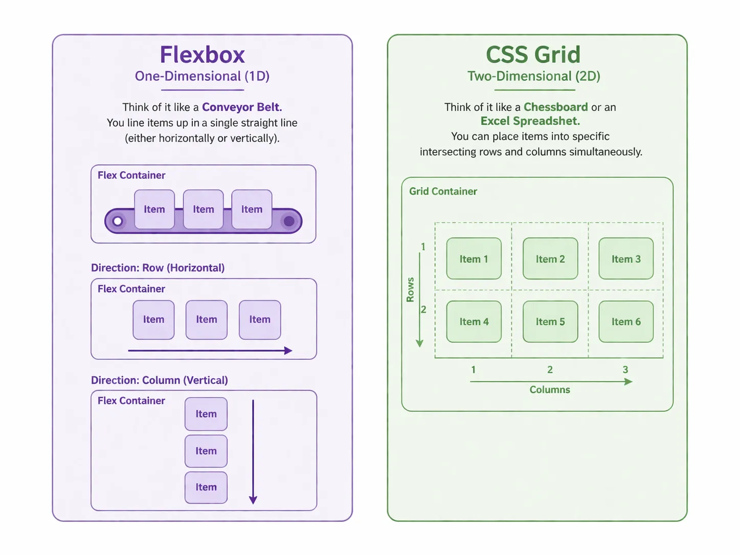
The Golden Rule: Use Flexbox for small-scale alignment (like centering items in a navigation bar). Use Grid for large-scale architectural layouts (like a photo gallery or a full dashboard).
7.2 Setting Up the Gridh3
Just like Flexbox, you do not apply the Grid property to the individual items. You apply it to the Parent Container.
.gallery-container { display: grid;}7.3 Defining Columns and The Fractional Unit (fr)h3
Once a container is a grid, you must tell the browser how many columns or rows you want. To do this, professionals use a special CSS unit called fr (Fractional Unit), which automatically calculates math for you by taking up a fraction of the available space.
.gallery-container {    display: grid;    /* Creates 3 columns of exactly equal size */    grid-template-columns: 1fr 1fr 1fr;
    /* Adds a perfect 20px space between all rows and columns */    gap: 20px;}
Pro-Tip: Typing 1fr 1fr 1fr 1fr for four columns can get messy. Professional developers use the repeat() function for cleaner code: grid-template-columns: repeat(4, 1fr);.
7.4 Aligning and Justifying in Gridh3
Grid gives you incredible control over exactly where things sit. To master it, you must understand two distinct layers of control: aligning individual Items within their cells, and aligning the Grid Structure as a whole within its container.
1. Aligning Items Inside Their Individual Cellsh4
These properties move the actual elements (like text, images, or buttons) inside the specific “box” or cell they occupy.
A. justify-items (Horizontal Alignment)h5
Moves items horizontally within their assigned cell.
justify-items: start(Left):
justify-items: end(Right):
justify-items: center(Center):
B. align-items (Vertical Alignment)h5
Moves items vertically within their assigned cell.
align-items: start(Top):
align-items: end(Bottom):
align-items: center(Center):
C. place-items (The Professional Shorthand)h5
Expertly centers both horizontally and vertically at once.
place-items: center:
2. Aligning the Entire Grid Within a Containerh4
If your Grid structure is smaller than the parent container (e.g., a wide hero section or a fixed-height layout), you can move the entire “board” around. Note: For these to be visible, we define fixed-width tracks so the grid doesn’t automatically stretch to fill the space.
D. justify-content (Horizontal Track Movement)h5
Moves the entire set of grid columns horizontally within the container.
justify-content: space-between:
justify-content: center:
E. align-content (Vertical Track Movement)h5
Moves the entire set of grid rows vertically within a container that has extra height.
align-content: center:
7.5 Check Your Knowledgeh3
Grid layout brings two-dimensional control to your designs. See if you can distinguish between grid tracks, cells, and alignment shorthand.
8. A TASTE OF RESPONSIVE DESIGN (@media)h2
At this point, you know how to build a beautiful layout for a laptop screen. But what happens if a user opens your website on a mobile phone? Without intervention, a two-column grid will squish the content until it is unreadable.
To fix this, professional developers use Media Queries.
8.1 The “If Statement” of CSSh3
Think of a Media Query as an “If Statement” for your design. It tells the browser: “If the screen shrinks below a certain size, stop using the normal CSS and use these new rules instead.”
8.2 The Syntax (@media)h3
You place media queries at the very bottom of your style.css file. The most common breakpoint (the pixel width where a design breaks) for tablets and mobile phones is 768px.
Here is how you write it:
/* Normal Desktop Styles */.hero-section {    display: grid;    grid-template-columns: repeat(2, 1fr); /* 2 Columns */}
/* The Mobile Media Query */@media (max-width: 768px) {    /* Any CSS written inside these brackets ONLY applies       if the screen is 768px wide or smaller! */
    .hero-section {        grid-template-columns: 1fr; /* Changes to 1 Column */        text-align: center; /* Centers text for mobile reading */    }}
What just happened? On a laptop, the browser ignores the @media block and shows two columns. The moment the user resizes their window or views it on a phone (making the screen 768px or smaller), the browser reads the @media block and overwrites the grid, stacking the columns neatly on top of each other!
Here is exactly how a developer makes this responsive in three distinct phases:
Phase 1: The Laptop / Desktop (No Breakpoint)h4
When you write your base CSS, you are designing for a wide screen. There are no media queries here. We simply tell the browser to create a nice, wide 2-column grid.
Example Code:
css:
style.css
/* create a file name it styles.css */ /* =========================================   1. INDUSTRY STANDARD RESET & BASE STYLES   ========================================= */    * {      margin: 0;      padding: 0;      box-sizing: border-box;    }
    body {      font-family: 'Segoe UI', Tahoma, Geneva, Verdana, sans-serif;      background-color: #f8fafc;      /* Soft off-white */      color: #0f172a;      /* Dark slate text */
      /* Using Flexbox on the body to push the footer to the bottom */      display: flex;      flex-direction: column;      min-height: 100vh;    }
    /* =========================================   2. DEFAULT LAYOUT (LAPTOPS & DESKTOPS)   ========================================= */
    .site-header {      padding: 30px 10%;    }
    .logo {      color: #2563eb;      /* Primary Blue */      font-size: 24px;    }
    /* The Main Grid Layout */    .hero-section {      display: grid;      grid-template-columns: 1fr 1fr;      /* Two exactly equal columns */      align-items: center;      /* Centers items vertically */      gap: 50px;      /* Space between text and image */      padding: 50px 10%;      flex-grow: 1;      /* Pushes the footer down */    }
    /* Typography & Button Styling */    .hero-content h1 {      font-size: 64px;      line-height: 1.1;      margin-bottom: 20px;    }
    .hero-content p {      font-size: 20px;      color: #475569;      margin-bottom: 40px;      line-height: 1.6;    }
    .cta-button {      display: inline-block;      background-color: #2563eb;      color: white;      padding: 16px 32px;      border-radius: 8px;      text-decoration: none;      font-size: 18px;      font-weight: bold;      transition: background-color 0.3s ease;      /* Smooth hover effect */    }
    .cta-button:hover {      background-color: #1d4ed8;      /* Darker blue on hover */    }
    /* Image Styling */    .hero-image {      width: 100%;      max-width: 600px;      /* Soft professional shadow */    }
    .site-footer {      text-align: center;      padding: 20px;      color: #94a3b8;      font-size: 14px;    }
html:
index.html
<!DOCTYPE html><html lang="en">
<head> <meta charset="UTF-8" /> <meta name="viewport" content="width=device-width, initial-scale=1.0" /> <title>Document</title> <!-- put the style here create a file styles.css and link it --> <link rel="stylesheet" href="styles.css"></head>
<body> <header class="site-header"> <h2 class="logo">NextGen Audio</h2> </header>
<main class="hero-section">
<div class="hero-content"> <h1>Sound, perfected.</h1> <p>Experience the next generation of spatial audio. Sign up below to get early access when we launch.</p> <a href="#" class="cta-button">Join the Waitlist</a> </div>
<div class="hero-image-wrapper"> <img src="assets/images/next-gen-audito.png" alt="A sleek, modern pair of wireless headphones" class="hero-image" loading="lazy"> </div>
</main>
<footer class="site-footer"> <p>© 2026 NextGen Audio. All rights reserved.</p> </footer>
</body>
</html>What it look like:
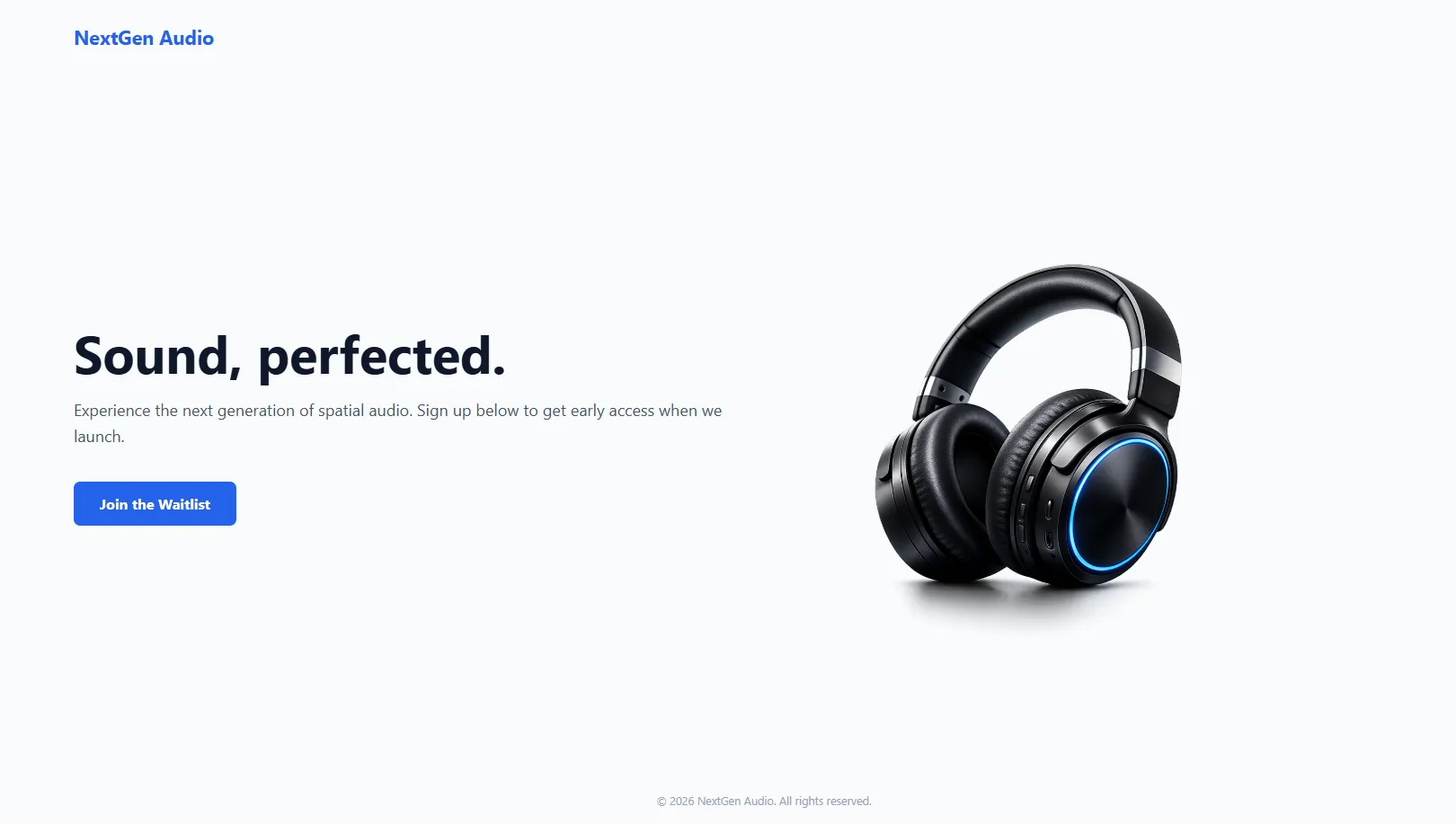
How it works: When the browser loads, it ignores all screen sizes and creates a massive 2-column layout (1fr 1fr). On a laptop, this looks perfect. But if you shrink your window, the 50px gap and 64px text will quickly make everything overlap.
Phase 2: The Tablet Squeezeh4
To fix the layout for medium screens like an iPad, we add our first Media Query at the very bottom of our CSS file. We only write the rules we want to change.
/* 2. TABLET LAYOUT (Screens smaller than 1024px) */@media (max-width: 1024px) {
  /* We keep the 2-column grid, but make the text smaller     and reduce the empty space so it fits on an iPad */  .hero-section {    padding: 40px 5%;    gap: 30px;  }
  .hero-content h1 {    font-size: 48px; /* Shrunk from 64px */  }
  .hero-content p {    font-size: 18px; /* Shrunk from 20px */  }}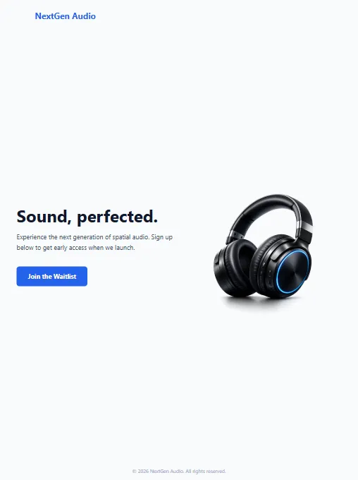
How it works: The browser constantly checks the screen size. If the width drops to 1024px or smaller, it activates this block. It keeps the 2-column grid intact but gracefully shrinks the text and spacing so it doesn’t look squished.
Phase 3: The Mobile Stackh4
Finally, if someone opens the site on an iPhone, a two-column grid is impossible to read. We need to completely destroy the grid and stack the content vertically. Add this at the bottom of your styles.css file.
/* 3. MOBILE LAYOUT (Screens smaller than 768px) */@media (max-width: 768px) {
  /* The core layout completely changes here */  .hero-section {    grid-template-columns: 1fr; /* Destroys the 2 columns, stacks into 1 */    text-align: center; /* Centers all text for easier reading on phones */    padding: 20px 5%;  }
  .hero-content h1 {    font-size: 40px; /* Shrunk further for small screens */  }
  /* Change the visual order so the image appears ABOVE the text on phones */  .hero-content {    order: 2;  }
  .hero-image-wrapper {    order: 1;    margin-bottom: 30px;  }
  .hero-image {    max-width: 100%; /* Ensures the image doesn't break the phone screen */  }}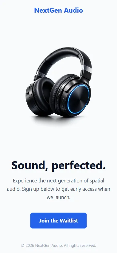
How it works: If the screen hits 768px or smaller, this final block takes over. It completely overwrites the original 1fr 1fr instruction, forcing the browser to stack the two boxes in a single column (1fr).
Pro-Tip: Notice the order property? In our HTML, the text comes first. But on mobile, we want the product image to show first. By giving the image wrapper order: 1 and the text order: 2, CSS visually flips them without touching the HTML!
8.3 Check Your Knowledgeh3
Responsive design is what makes your sites usable on any device. Let’s recap how media queries and visual ordering work.
9. DEBUGGING CSS FUNDAMENTALSh2
Writing CSS is only half the job. The other half is figuring out why the browser is ignoring your instructions. When your layout breaks or a color refuses to change, do not panic. Every developer experiences this daily.
Instead of randomly changing code and hoping it works, follow the standard debugging checklist.
9.1 The “Why Isn’t This Changing?” Checklisth3
When your CSS is not applying to your HTML, 95% of the time, it is one of these four fundamental mistakes:
1. You Forgot to Save the File It sounds obvious, but it happens constantly. If you change your HTML or your CSS (or both) and forget to save, the browser will not see the updates.
- The Fix: Look at the top of your VS Code window. If there is a white dot next to your file name, you have unsaved changes. Press
Ctrl + S(Windows) orCmd + S(Mac).
2. The Stylesheet is Disconnected If absolutely none of your CSS is working, your HTML file probably cannot find your CSS file.
- The Fix: Check the
<head>of your HTML. Ensure the<link rel="stylesheet" href="style.css">is there. Verify that you spelled the filename exactly right.styles.cssis not the same asstyle.css.
3. Typographical Errors (The Mismatched Class)
CSS is strictly case-sensitive and spelling-dependent. If your HTML says <div class="profile-card"> but your CSS targets .ProfileCard { ... } or .profile-crad { ... }, the style will fail entirely.
- The Fix: Copy and paste your class names directly from your HTML into your CSS to avoid spelling mistakes. Also, check for missing dots (
.) before class names or missing semicolons (;) at the end of your rules!
4. Browser Caching (The Hidden Culprit) Browsers are designed to be fast. To save time, they often download your CSS file once and reuse that old version, even if you just saved a new update in VS Code.
- The Fix: Do a “Hard Refresh” to force the browser to clear its memory and fetch your latest code.
- Windows:
Ctrl + F5orCtrl + Shift + R - Mac:
Cmd + Shift + R
- Windows:
9.2 Using Developer Tools to Fix CSSh3
In Module 1, we used Developer Tools to look at errors in the Console. Now, we will use it to fix visual bugs in real-time.
- Right-click the element on your webpage that looks broken and click Inspect.
- On the right side (or bottom) of the Developer Tools panel, look for the Styles tab.
- Here, you will see exactly which CSS rules are currently affecting that specific HTML element.
The Superpower: You can click the checkbox next to any CSS property in the Developer Tools to turn it on or off. You can even click on a number (like padding: 20px;) and use your keyboard’s up and down arrows to change the value in real-time.
Note: Changes made in Developer Tools do not save to your VS Code file! They are just for testing. Once you find the perfect number, you must copy it back into your actual style.css file.
9.3 Check Your Knowledgeh3
The debugging mindset is what separates beginners from pros. Test your ability to spot common CSS pitfalls and use the dev tools to fix them.
10. FINAL THOUGHTSh2
Congratulations! You have successfully navigated the foundational pillars of front-end development. You have transformed from writing simple text into creating structured, styled, and responsive web layouts.
Key Takeaways to Remember:
- Semantic HTML is the skeletal structure that gives your content meaning and accessibility.
- The CSS Box Model is the fundamental logic behind how every element takes up space.
- Flexbox and Grid are your power tools for arranging elements in one or two dimensions with ease.
- Responsive Design ensures your hard work looks professional on any device, from the smallest phone to the largest monitor.
The path to becoming a professional developer is built on these fundamentals. Don’t worry if it doesn’t all make sense right away. When I first started learning, I felt completely overwhelmed, too. But I kept practicing. What truly motivated me was building real projects, and I can tell you from experience that the best way to master these skills is through consistent, hands-on practice.
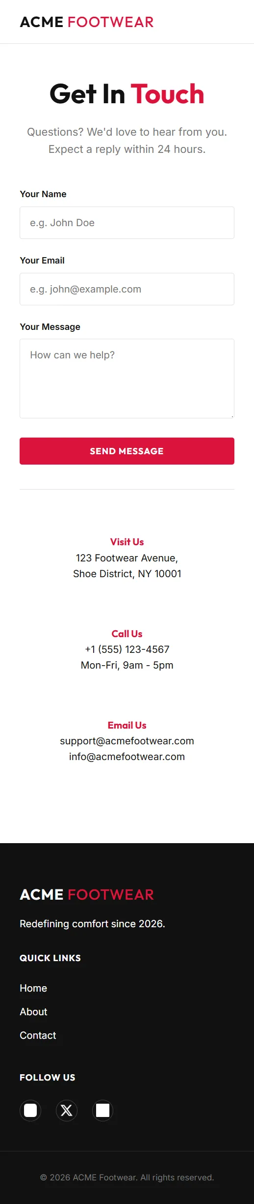
11. FINAL PROJECT: ACME FOOTWEAR CHALLENGEh2
To wrap up this module, you will take on the ACME Footwear Challenge. This project is designed to test your ability to replicate a professional design from scratch using only HTML and CSS.
Project Overviewh3
Your mission is to build a premium, three-page retail website (Home, About, and Contact) that is fully responsive. You will be provided with a starter kit containing all the necessary assets (images, logos, and screenshots) to ensure you can focus entirely on your HTML and CSS implementation.
Visual Reference Guideh3
Your goal is to replicate these layouts with pixel-perfect accuracy for both desktop and mobile viewports.
🏙️ Desktop Mode (1920x1080)h4
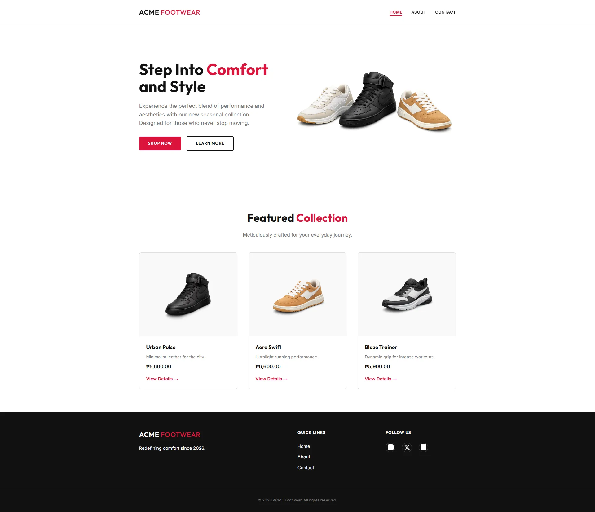
📱 Mobile Mode (375x812)h4
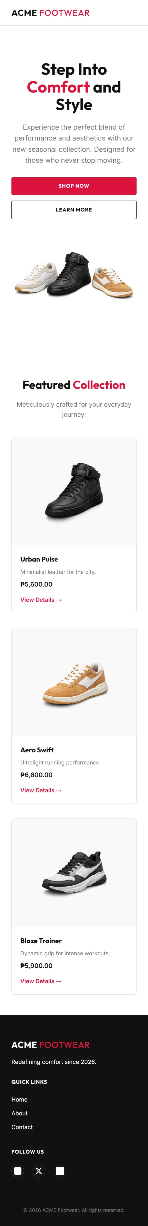 | 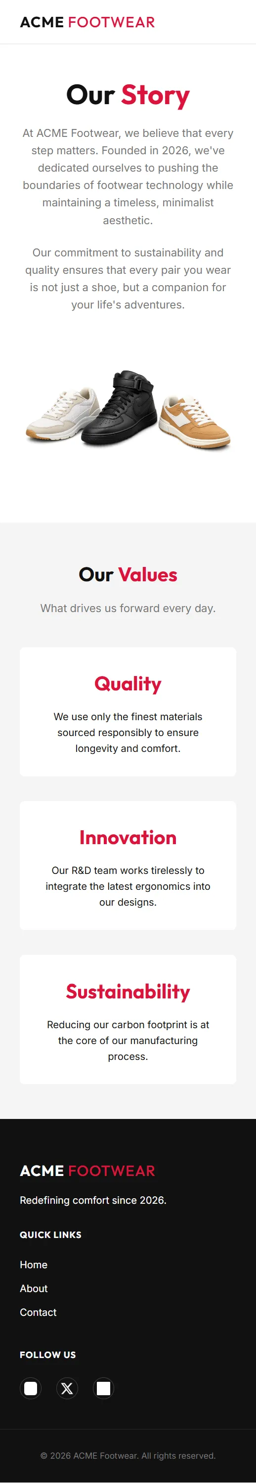 |  |
|---|---|---|
| Home Page | About Page | Contact Page |
Instructions & Setuph3
The complete, step-by-step instructions for this challenge—including cloning the repository, design requirements, and implementation phases—are hosted on GitHub.
👉 View Full Project Instructions on GitHub
How to Submith3
Once you have completed the challenge:
- Upload your project to a public repository on GitHub.
- Share the repository link with enehry@gmail.com for review and feedback.